Pantone Color of the Year 2025 & Spring/Summer 2025 Color Forecast
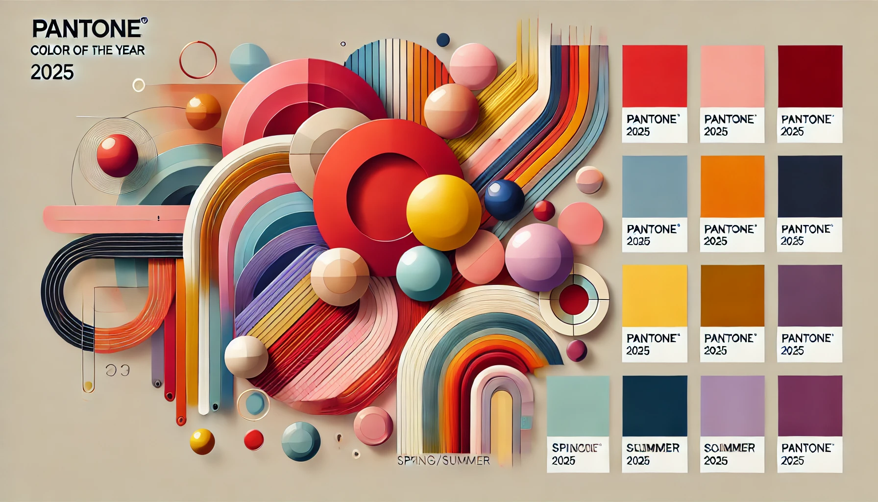
Every year, the design world eagerly awaits the announcement of the Pantone Color of the Year, a single hue that shapes trends across multiple industries, from graphic design and printing to fashion and interior décor. The 2025 Pantone Color of the Year will be no exception, setting the tone for the coming year’s creative projects and brand identities. In this article, we’ll dive deep into what to expect from the Pantone Color of the Year 2025 and explore the vibrant Spring/Summer 2025 color forecast, providing insights on how these colors will influence design and printing trends.
What is the Pantone Color of the Year?
History of Pantone's Color of the Year
The Pantone Color Institute has been selecting a Color of the Year since 2000, with each year’s color being chosen through a rigorous process of analyzing global trends. Pantone’s team looks at everything from art, entertainment, and fashion to socio-economic conditions, technology, and even political movements. The selected color becomes a symbol of the year’s mood, helping to communicate a shared experience through visual representation. Over the years, Pantone’s choices have gone beyond simply reflecting trends; they have shaped them.
The Influence of Pantone on Design and Printing
Pantone’s annual color selection has a profound impact on the world of design and printing. Whether it’s used in brand logos, marketing materials, signage, or product packaging, the Pantone Color of the Year influences a wide array of creative fields. For graphic designers and print shops, this trend sets the stage for the color palettes clients will request and for how brands will express themselves visually. In many ways, Pantone helps align consumer expectations with the visual outputs produced by industries, including custom printing and signage.
The Pantone Color of the Year 2025 – What to Expect
Predicted Trends for 2025
As we move into 2025, the world is becoming increasingly interconnected, and the color trends are expected to reflect this global unity. The 2025 Pantone Color of the Year will likely be a hue that resonates across cultures, evoking a sense of harmony and collective resilience. With sustainability and eco-consciousness continuing to shape consumer behavior, shades that represent nature, renewal, and organic beauty are strong contenders. Think earthy tones or even a fresh, vibrant color that symbolizes growth and forward movement.
Insights Into the Selection Process
Pantone’s color experts don’t just pick a hue based on aesthetics alone. The color of the year is selected after months of research, trend analysis, and observation of how color is used in various industries. They examine the influences of technology, current events, and even cultural shifts in order to choose a color that best captures the zeitgeist of the moment. The 2025 Pantone Color will likely reflect both the optimism for the future and the need for balance and calm in an ever-evolving world.
The Symbolism Behind the Pantone Color of 2025
Emotional and Psychological Impact of the 2025 Color
The Pantone Color of the Year is more than just a visual choice; it carries deep emotional and psychological significance. Colors have the power to evoke specific emotions, moods, and reactions. For 2025, the chosen color may aim to invoke feelings of optimism, renewal, or calmness in a world that is continuing to recover and transform from recent global challenges. Whether it’s a vibrant tone that inspires energy and creativity, or a more subdued shade that fosters tranquility and introspection, the psychological impact of the 2025 color will resonate with individuals and businesses alike.
How the 2025 Color Reflects Global Trends
Pantone’s Color of the Year is often a reflection of broader cultural and societal shifts. In recent years, sustainability, mental wellness, and inclusivity have become more important to both consumers and businesses. These themes are likely to influence the 2025 color as well. A color that symbolizes harmony with nature or balance in our increasingly digital lives could be a natural fit. It may also reflect global movements toward eco-friendly practices, minimalism, or even a renewed appreciation for craftsmanship and authenticity. The 2025 Pantone color will likely capture this blend of technological advancement and a return to simpler, more mindful living.
Spring/Summer 2025 Color Forecast – A Vibrant Palette
Key Color Trends for Spring/Summer 2025
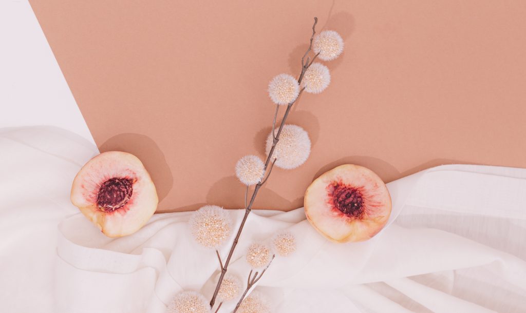
As we look ahead to Spring/Summer 2025, color trends are predicted to be a dynamic blend of bold, bright hues alongside calming, earthy tones. Designers are expected to embrace a duality between excitement and serenity, giving people the freedom to express both their vibrant, playful sides and their need for calm and balance. Expect to see a mix of energetic shades like fiery reds and oranges, balanced by softer, grounding tones like sage green and sky blue. This balance allows for versatility in design across industries, whether it’s in fashion, print, or graphic design.
Bright & Bold: Warm Colors for Spring/Summer 2025
Warm colors are always a hit during the spring and summer months, and 2025 will be no different. Bold tones like warm yellows, vivid oranges, and lively reds are expected to dominate the color forecast. These hues represent energy, passion, and creativity—perfect for brands and designs that want to inspire action and enthusiasm. Whether used in fashion, marketing campaigns, or product designs, these bold colors will help make a statement in the warmer months of 2025.
Cool & Calming: Soft Tones in Spring/Summer 2025
On the flip side, designers will also turn to cool and calming colors that bring a sense of peace and tranquility. Soft pastels like lavender, mint green, and pale blues will help create designs that feel refreshing and serene. These colors offer a soothing alternative to the more vibrant palette, ideal for industries focused on wellness, sustainability, or even luxury. As consumers continue to prioritize mental health and self-care, these cool tones will find their place in fashion, interior design, and even digital spaces.
How to Incorporate the Pantone Color and Seasonal Trends in Graphic Design
Practical Applications for Branding
Incorporating the Pantone Color of the Year into branding can help businesses stay current and relevant. For 2025, designers can integrate the chosen color into brand logos, websites, packaging, and promotional materials. Whether it’s the main color or used as an accent, the Pantone Color of the Year offers brands a fresh way to connect with their audiences. For example, a company looking to emphasize eco-friendliness might use a nature-inspired color palette, incorporating the 2025 Pantone hue alongside greens and earth tones. Businesses can leverage the emotional resonance of color to enhance their brand identity and storytelling.
Graphic Design for Print Using the 2025 Palette
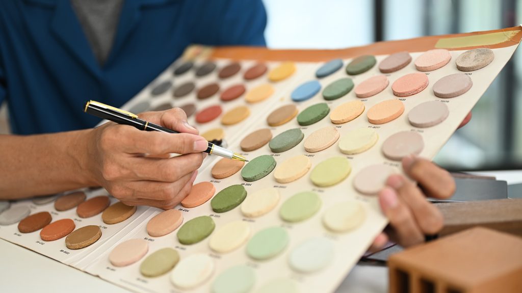
Print design is another area where the 2025 color trends will have a big impact. Whether you’re designing business cards, brochures, banners, or signage, using the Pantone Color of the Year and the Spring/Summer 2025 palette can make your designs feel both modern and memorable. For designers working with print shops like Custom Design Signs & Printing, color consistency is crucial. Pantone’s standardized system ensures that what you see on screen will be faithfully reproduced in print, maintaining the integrity of your design. Using 2025’s trending colors strategically can make your prints stand out and resonate with clients.
Industry-Specific Applications for the 2025 Color Trends
Each industry will interpret the 2025 Pantone Color and seasonal trends in unique ways. For example, in packaging design, bold, vibrant colors might be used to grab attention on store shelves, while in tech and digital spaces, softer tones could dominate user interface designs to create calm and seamless user experiences. By aligning your design approach with color trends, you can position your brand as forward-thinking and relevant to current consumer preferences.
Industry-Specific Applications for the 2025 Color Trends
Fashion Industry’s Embrace of the 2025 Colors
The fashion industry is always at the forefront of color trends, and the Spring/Summer 2025 forecast will certainly influence runway collections. Designers are likely to use bright, bold hues to evoke joy and self-expression, while soft, muted colors may appear in relaxed, sustainable fashion pieces. Expect to see these colors making waves not just in high fashion, but also in everyday clothing, accessories, and footwear. Brands in the fashion world can capitalize on these trends by incorporating the Pantone Color of the Year into their seasonal collections, offering consumers both style and trend alignment.
Interior Design and Home Décor Trends for 2025
The 2025 color trends will also have a strong influence on interior design and home décor. Consumers are increasingly seeking to create spaces that feel like sanctuaries, and the cool, calming tones predicted for Spring/Summer 2025 will play a key role in achieving that. Expect to see these colors in wall paints, furniture, and textiles, offering a refreshing alternative to the neutral tones that have dominated recent years. By using the Pantone Color of the Year in accent pieces like cushions, rugs, and décor items, homeowners can easily update their spaces with a contemporary twist.
Marketing and Advertising Trends
For marketers and advertisers, the Pantone Color of the Year and the Spring/Summer 2025 color palette offer a powerful tool for communicating brand messages. Color has a profound effect on consumer perception and decision-making, and using the right hues can increase engagement and conversion rates. By incorporating these trending colors into campaigns—whether through social media, digital ads, or print materials—brands can evoke the right emotions and connect more deeply with their target audience. The 2025 color trends will help brands stay fresh and relevant in the eyes of their consumers.
Custom Design Signs & Printing – Your Color Partner for 2025
Why Choose Custom Design Signs & Printing for 2025 Trends
At Custom Design Signs & Printing, we understand the power of color in creating impactful designs. Whether you’re looking to refresh your brand or produce eye-catching marketing materials, we stay ahead of color trends, including the Pantone Color of the Year and the Spring/Summer 2025 forecast. Our team of experienced designers and printing specialists can help you incorporate the latest hues into your branding, ensuring that your business remains relevant and visually appealing in a competitive market.
Services We Offer to Incorporate the Pantone and Seasonal Colors
Our services cover a wide range of design and printing solutions, from business cards and brochures to large-scale signage and banners. With the Pantone Color of the Year 2025 and the Spring/Summer palette as guides, we can help you create customized designs that reflect your brand’s personality and the latest trends. Using our state-of-the-art printing technology, we guarantee color accuracy and high-quality results for all your printed materials. Whether you’re rebranding, launching a new campaign, or simply refreshing your marketing assets, we’re here to bring your vision to life with the perfect color choices.
Marketing and Advertising Trends
As the design world looks ahead to 2025, color will continue to play a central role in how businesses communicate with their audiences. The Pantone Color of the Year 2025 and the Spring/Summer 2025 color trends offer exciting opportunities for creative expression, whether in graphic design, fashion, or interior décor. By embracing these trends, brands can ensure they stay visually relevant and resonate with their customers on a deeper level. At Custom Design Signs & Printing, we are ready to help you incorporate these colors into your projects, providing expert design and printing services that bring your ideas to life in vivid, on-trend hues.
FAQs
The Pantone Color of the Year is an annual selection made by the Pantone Color Institute, which reflects global trends and influences across various industries. It serves as a forecast for the year’s dominant design themes.
You can use the Pantone Color of the Year in your branding, logo designs, marketing materials, packaging, or interior décor to stay on trend and connect with consumers who are influenced by color trends.
The Spring/Summer 2025 color forecast features a mix of bold, energetic shades like reds and oranges, along with calming tones like soft greens and blues. These colors will dominate fashion, graphic design, and interior décor trends.
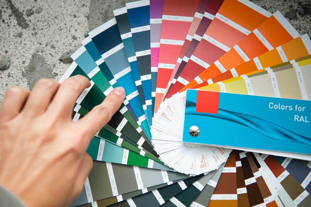
Pantone’s color matching system standardizes colors across different mediums, ensuring that the color you see on screen or in a digital format matches what is printed or produced, making it essential for designers and print shops.
Custom Design Signs & Printing has the expertise and technology to incorporate the Pantone Color of the Year and seasonal color trends into your designs. We offer personalized services to ensure your printed materials are modern, impactful, and of the highest quality.